
The 'Neutral-Tone' Calibration: Precision Color Theory for Skin-Tone Harmonization
Master the science of color theory to move beyond trends, ensuring every manicure you perform enhances your client's natural skin undertones with mathematical precision.
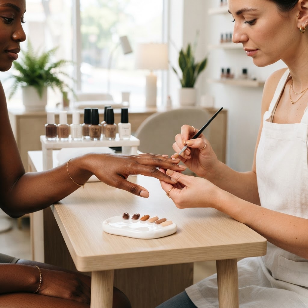
Beyond the Palette: The Science of Undertone Mapping
For a professional nail artist, choosing a shade is rarely about personal preference—it is about color theory. When a client complains that a 'perfect' nude polish looks 'off' or 'muddy,' they are identifying a dissonance in color temperature. By mastering the 'Neutral-Tone' Calibration, you can guarantee a flattering finish every time.
The Tri-Factor Undertone Assessment
Before opening a bottle, you must identify the client's skin undertone. Skin falls into three primary categories:
* Cool Undertones: Skin with blue, pink, or reddish hues. These clients thrive when paired with 'cool' pigments containing blue, violet, or pure white bases.
* Warm Undertones: Skin with yellow, peach, or golden hues. These clients are best served by 'warm' colors with orange, gold, or deep yellow undertones.
* Neutral Undertones: A balanced mix where the skin lacks a strong dominant hue. These clients possess the widest range of flexibility, though they often look best in muted or 'dusty' tones.
The Vein and Jewelry Diagnostic
If you are unsure of a client's undertone, perform a quick diagnostic:
Join the newsletter
Get fresh nail tutorials, trends, and business tips straight to your inbox.
Calibrating Your Gel Selection
Once the undertone is identified, use this calibration protocol to guide your product selection:
* For Cool-Toned Clients: Avoid yellow-based nudes or warm, saturated oranges. Instead, select shades like berry, icy pink, or cool-toned mauve. If you must use a neutral color, choose one with a high concentration of white pigment (sheer, milky whites) to maintain a crisp look.
* For Warm-Toned Clients: Avoid 'chalky' pastels or cool, blue-based reds. Focus on shades like coral, warm terracottas, cream-based nudes, or rich gold-infused neutrals. These colors harmonize with the golden hue in the skin, preventing the skin from appearing sallow.
Managing the Saturation Gradient
Beyond hue, consider the *value* of the color. A color's value—how light or dark it is—should ideally contrast with the skin tone to avoid the 'nude-blind' effect, where the nail blends too perfectly into the finger, making the hand look stunted.
* Low Contrast: If a client has fair skin, a medium-value nude will provide a sophisticated 'barely there' look. If you go too light (matching the skin exactly), it can wash the client out.
* High Contrast: Deep skin tones require saturated, high-pigmented colors to stand out. Avoid thin, translucent formulas that can appear streaky or gray on darker skin. Instead, reach for deep creams, intense berries, or warm, spicy earth tones.
The Professional Recommendation Workflow
Join the newsletter
Get fresh nail tutorials, trends, and business tips straight to your inbox.
