
The 'Chromesthesia' Color-Mapping Framework: Designing Palette Cohesion for High-End Nail Art
Move beyond basic color wheels by mastering the Chromesthesia framework to engineer professional, high-impact color stories that elevate your nail art from decorative to designer-level.
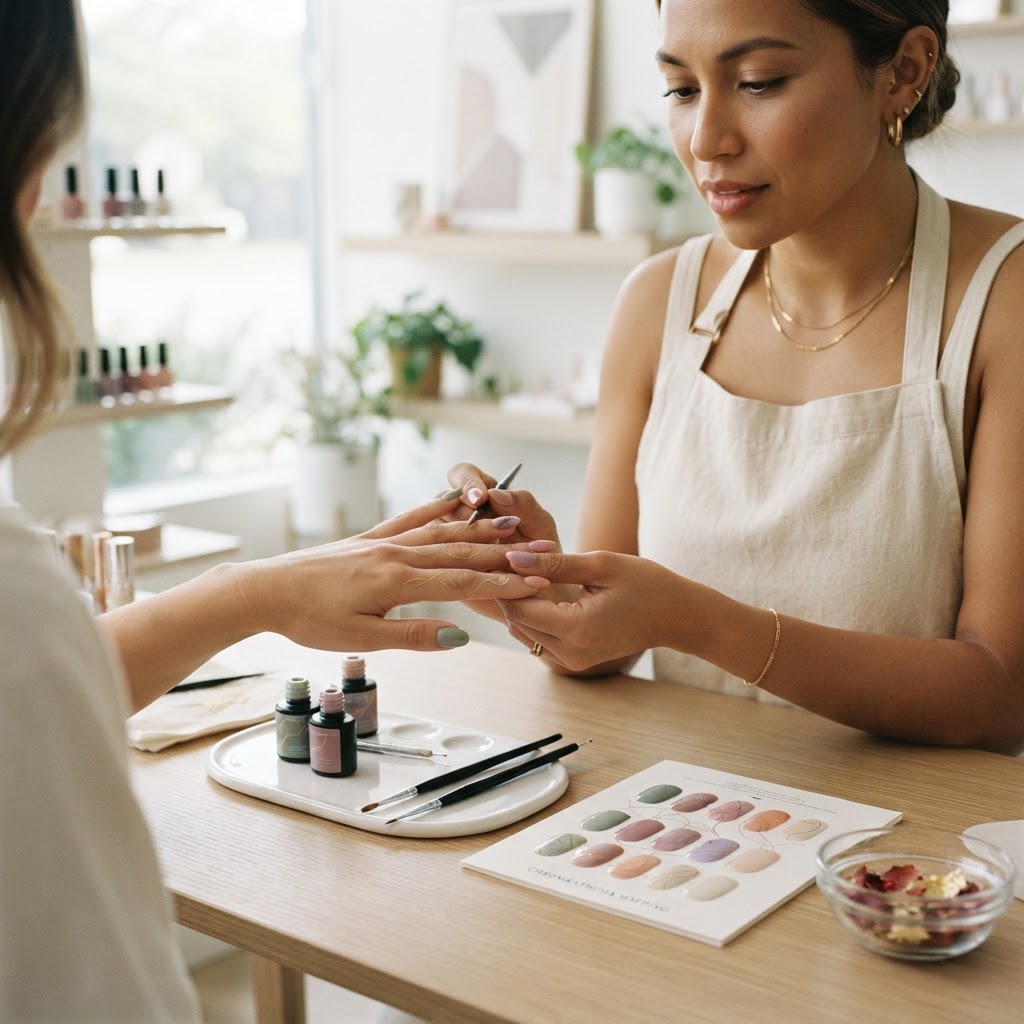
The Architecture of Color Theory in Nail Artistry
Many nail artists select colors based on intuition or client preference, leading to palettes that feel disjointed or chaotic. To achieve a luxury look, you must move from 'choosing colors' to 'engineering palettes.' The Chromesthesia Color-Mapping Framework treats color as a system of relationships based on saturation, temperature, and value, ensuring every nail art design feels intentional and cohesive.
1. The Value-Saturation Matrix
Every color in your gel collection has two hidden variables: Value (how light or dark it is) and Saturation (how vibrant or muted it is). A common mistake is combining colors of equal value and saturation, which results in a 'flat' design. To create depth:
* The 70/20/10 Rule: Assign 70% of the surface area to a neutral or base value, 20% to a supporting tone, and 10% to a high-contrast accent.
* Avoid the 'Gray-Scale Trap': When using pastels, ensure you introduce at least one high-saturation 'anchor' color. Without a saturated anchor, soft designs often lose their structural visual weight.
2. Temperature Balancing: The 'Warm-Cool' Pivot
Color temperature dictates the mood of your set. Warm colors (reds, oranges, yellows) expand, while cool colors (blues, greens, purples) recede.
* The Pivot Point: If you are working with an inherently warm client skin tone, use a cool-toned accent color to create a 'visual pop' that forces the eye to focus on the nail art.
Join the newsletter
Get fresh nail tutorials, trends, and business tips straight to your inbox.
* Gradient Control: When performing ombrés or gradients, always bridge the gap between warm and cool colors with a neutral (like taupe, soft gray, or sheer white). This prevents the colors from appearing 'muddy' where they overlap.
3. Implementing the 'Light-Refractive' Layering Strategy
Advanced artists differentiate their work through light manipulation. By layering colors based on their refractive properties, you can create the illusion of glass-like depth.
* Opaque Foundations: Use these for structural support and color blocking. They provide the 'floor' of your design.
* Sheer Translucents: These act as 'filters.' Applying a sheer, tinted jelly polish over an opaque base changes the perceived hue and temperature, allowing for custom color creation without buying new inventory.
* Metallic Interlayers: Place metallic elements (flakes or chrome) between layers of sheer gel to create a 'buried' effect that glimmers rather than glares.
4. Designing for Skin-Tone Compatibility
Your palette must function as an accessory. Use the 'undertone matching' protocol to ensure the art complements the wearer:
* Cool Undertones: Best paired with berries, true blues, and icy whites. Avoid yellow-based oranges.
* Warm Undertones: Best paired with earth tones, rich terracotta, and olive greens. Avoid stark, chalky pastels.
* Neutralization: If a client insists on a color that conflicts with their undertone, use a sheer 'neutralizer' top coat or a delicate encapsulated design feature to soften the boundary between the nail and the skin.
Actionable Workflow for Palette Creation
Join the newsletter
Get fresh nail tutorials, trends, and business tips straight to your inbox.